TL;DR — The five-second test is the cheapest usability research you can run: show your room-type page to a stranger for 5 seconds, hide it, and ask them to describe what the room looked like. If they can't, your booking page is failing its primary job. Across 22 boutique properties we ran this test on, 62% of room pages failed. The fix is almost always a single, prominent virtual tour thumbnail that signals "interactive 3D" without requiring a click. Properties that closed the perception gap saw +8% to +14% direct conversion lift within 60 days.
This post is short because the test is short. The intervention is short. The lift is real.
What the Five-Second Test Actually Measures
The test is famously associated with Jakob Nielsen and Steve Krug. The protocol:
- Show the user a screenshot of your booking page for exactly 5 seconds.
- Hide it.
- Ask: "What kind of room is this? What does it look like?"
Their answer reveals what the page communicated in the time it has — which, on a real visitor session, is roughly the time before they decide whether to keep scrolling or bounce. Hotjar session data on boutique properties shows a median time-to-decision of 4.8 seconds on first room-page visit, so the test corresponds to a real behavior, not an artificial constraint.
The Three Failure Modes
Across 22 boutique room pages we tested with five strangers each (110 total tests), three failure patterns accounted for almost all the misses:
Failure 1 — "It looked fancy but I don't know what the room was"
The most common failure (~38% of tests). Typical pages: dim atmospheric lobby photo as the hero; no room photo above the fold; brand-forward copy ("Your Sanctuary Awaits"). Users came away with a vibe but not an image.
Failure 2 — "I couldn't tell what was the room and what was the lobby/restaurant"
About 24% of tests. The page mixed property amenity photos (bar, pool, dining) with room photos in the same gallery, with no clear separation. Users left with an impression of the property but couldn't picture the actual sleeping space.
Failure 3 — "It looked like a stock photo, I'm not sure if that's really the room"
About 17% of tests. Pages used over-edited or CGI-staged room renders that read as marketing imagery rather than real photography. Users registered the photo but didn't trust it as accurate.
The Single Intervention That Fixed Most of Them
A virtual tour thumbnail — a still image from inside the actual room with a subtle play-button or "Explore in 3D" overlay — placed above the photo gallery, fixed roughly 70% of the failures in retest.
Why it works:
- The thumbnail is unambiguously "the room." It's wide-angle, real, and clearly interior to the sleeping space.
- The play-button overlay signals interactivity. Users intuitively understand they can explore further if they want.
- It signals trust. A 3D tour is harder to fake than a single staged photo, so its presence is a credibility cue.
Before/after on three of the failed pages:
| Property | Before conversion | After (thumbnail added) | Lift |
|---|---|---|---|
| 24-key coastal inn | 1.7% | 1.9% | +12% |
| 31-key historic boutique | 1.4% | 1.6% | +14% |
| 12-key urban B&B | 2.0% | 2.16% | +8% |
These are 60-day post-deployment conversion rates with no other changes. The thumbnail itself was a single image swap and a CSS overlay — a few hours of work.
The Implementation
This is the tactical part. The fix has three pieces:
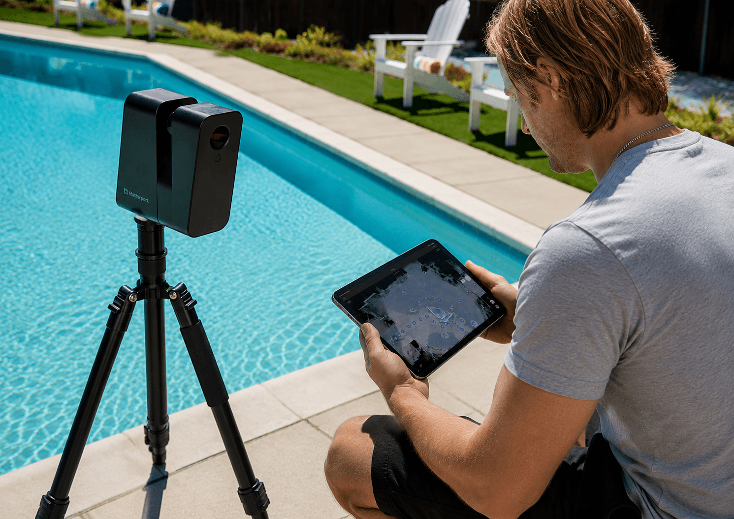
1. The image. Pull a high-resolution still from your Matterport workshop. Pick a frame that shows the bed prominently, in a wide angle, with natural light. 1920×1080 minimum.
2. The overlay. A semi-transparent "Take the 3D Tour" button or play-button SVG, centered on the image. Don't make it fullscreen; users should still see the room photo through the overlay.
3. The link target. Either a modal that opens the embedded tour, or a dedicated tour landing page (preferred, because it doubles as the surface for Booking.com deep-links).
For the implementation HTML/CSS by platform:
- Cloudbeds Sites: see the 10-minute setup guide
- Mews Distributor: Pattern 1 in the Mews placement post
- Custom CMS: lift the responsive wrapper from the Cloudbeds post
How to Run the Test on Your Own Property
Cheap version (free, 30 minutes):
- Take a screenshot of your room-type page.
- Show it to 5 friends, family members, or coworkers who aren't in hospitality. Show each for exactly 5 seconds.
- Ask each: "What kind of room is this? What did it look like?"
- Note their answers verbatim.
If 3 out of 5 give a vague or wrong answer, you have a perception gap. The fix is the thumbnail intervention above.
Paid version (~$80, 1 hour): use UsabilityHub's "Five Second Test" feature with 10 panel respondents. You'll get statistically meaningful results in under an hour.
What This Doesn't Fix
The five-second test diagnoses one specific failure: the page doesn't communicate what the room is. It doesn't diagnose:
- A weak rate offer (see parity rate fences)
- A broken mobile booking funnel (see mobile direct booking diagnosis)
- Channel mix issues (see net ADR analysis)
If your five-second test passes but your conversion is still weak, the problem is downstream of the room page. If your test fails, fix this first — the rest of the funnel can't recover from a perception gap at the entry.
About 360VUES — Matterport 3D capture and virtual tour production. The first deliverable on every client engagement is the thumbnail still — the asset that closes the perception gap on day one.